L’azurde
Middle Eastern gold and jewelry company, transforming every inspiration into a unique masterpiece.

Background
L’azurde is the largest gold and jewelry company in the Middle East and Africa and the 4th largest jewelry manufacturer worldwide. In light of a rapidly expanding customer base and upcoming future collaborations with global brands, L’azurde was in need of a website redesign intended to reach consumers all over the world.
Challenge
The entire website needed a redesign. We also needed interaction design experience. We found the returning items experience to be non-existent. There are outdated images and slow image loading. User research has shown that even a second delay has led users to forfeit their purchase. There is no mobile version. There is a confusing navigation, filter, and checkout experience. We need to accommodate and display more brands for current and future business direction.
Goals
In collaboration with L’azurde’s marketing team, we created three key focus areas for the vision of the new product:
User: easy to use and adaptable to multiple languages and currencies
Business: able to retain customers and incite them to create an account and increase engagement
Product: create a clean and polished interface that elevates the brand and highlights its high-quality aesthetic vision
My Impact
We presented deliverables to the engineering team over the course of several weeks. In addition, we had to create several Arabic-translated templates that read right to left in order to display a page for an Arabic-speaking user. We also added an interaction design that is displayed in the prototype.
The product was finalized and launched to the public in November 2022.
Research
Utilizing client feedback and user research, I identified several key problems and desired new features with the old landing page and PDP page.
I also identified problems with the PLP, its filter, and the menu navigation. These required a higher level of UX thinking and architectural design.
Art Direction
With the intention of creating a worldwide brand, we recommended infusing the brand colors into the photography rather than in the UI elements. We believed a simple and clean UI to be the best as it can attract a broad range of consumers. Collaboratively, we came up with four different art directions that were presented to leadership.

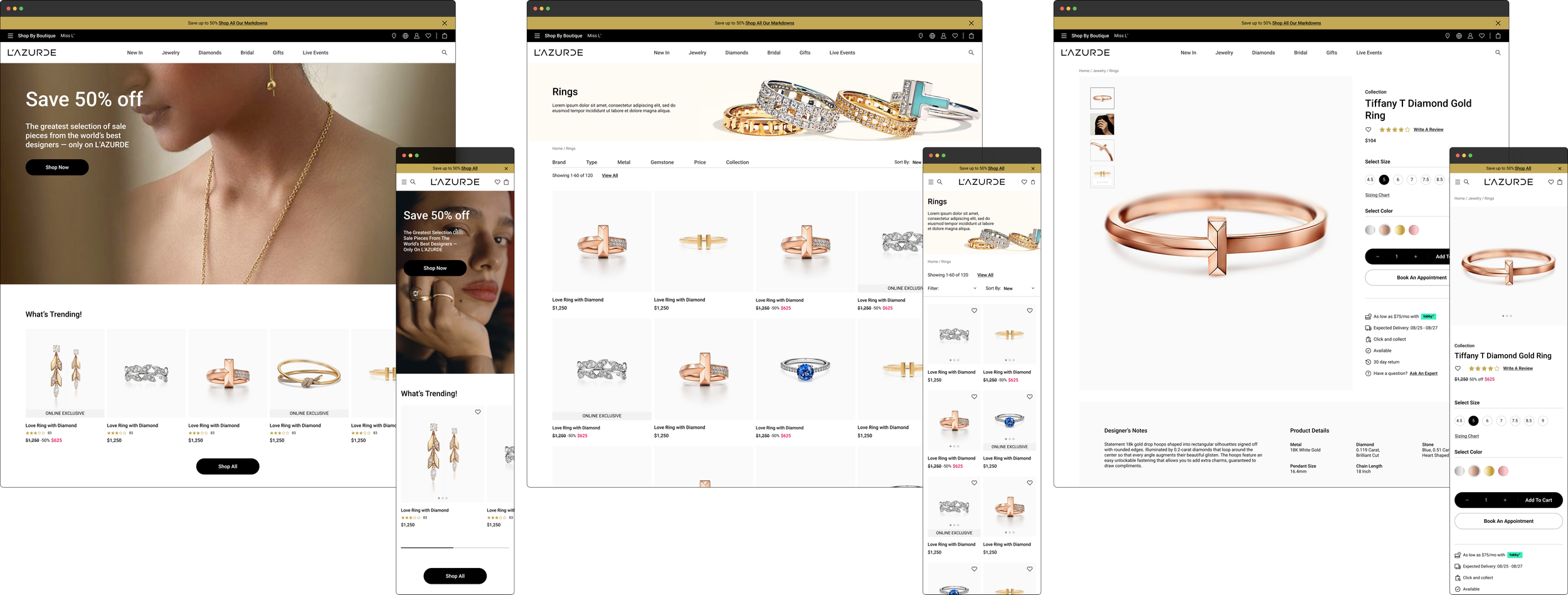
Design & Iteration
Landing Page, PLP, & PDP
Upon review, the head of marketing believed the directions felt more boutique instead of the mass retailer as they envisioned. They believed the designs should be more commercial extending into the UX. As much as we wanted a more subtle and artistic vision, they believed the call to action should be louder and more prominent.
They also wanted a persistent and prominent brand toggle in the header and footer, an Instagram display feature, and a product hover feature.

After four successive iterations, we landed on a final design that invoked the mass retailer experience the client wanted. The color palette was also changed to create a more luxurious environment that the brand was headed towards. The boutique navigation was changed to a dropdown to leave space for future boutiques the company was planning to launch.
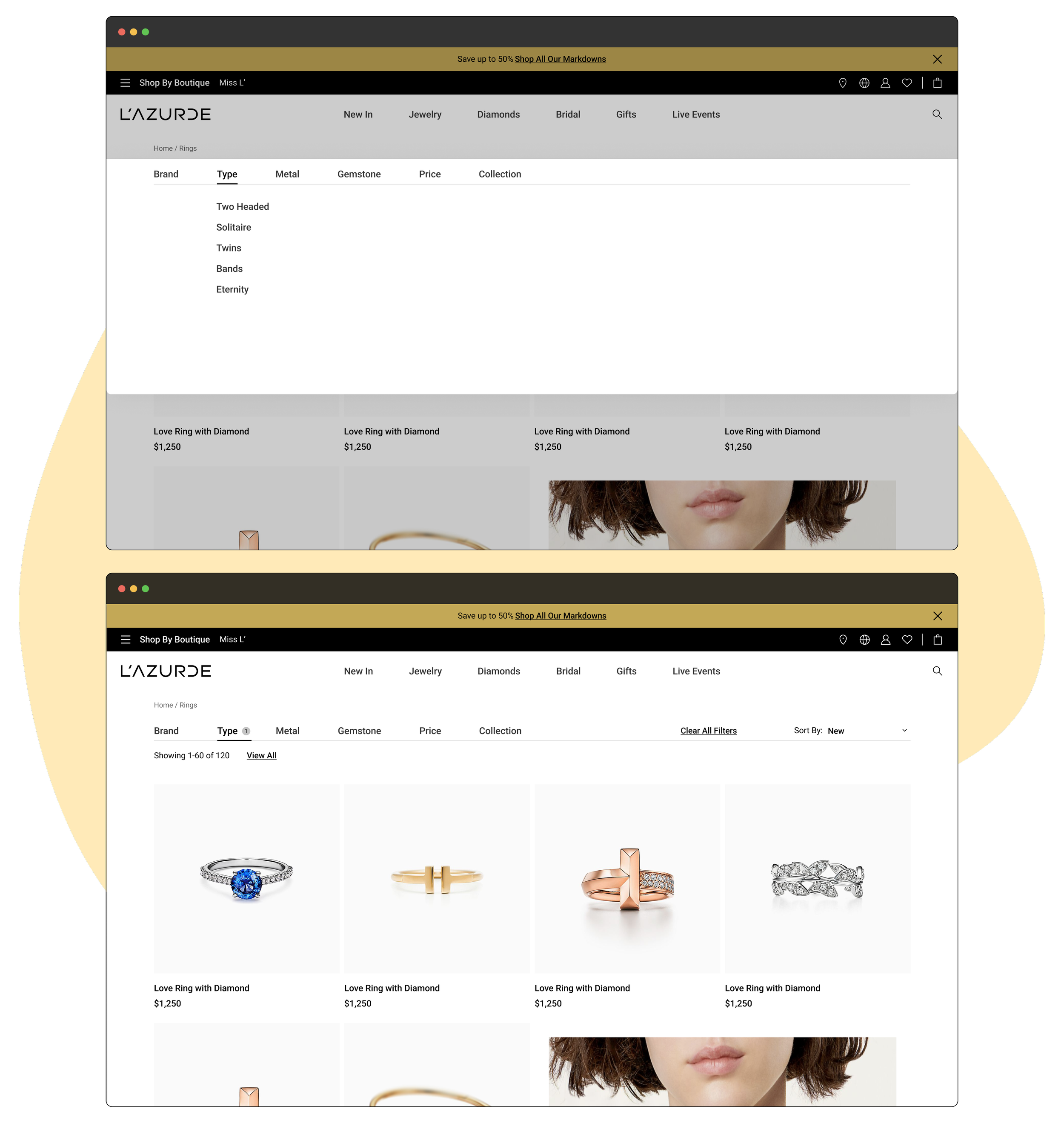
PLP Filter
The product category page filter needed a re-design. We coordinated with the marketing team in order to create a better filter architectural hierarchy. The product category page product images were outdated. Breadcrumbs were difficult to navigate and icons were placed arbitrarily without the best UX practice in mind.
In iteration 1, we created a unique and experimental filter design. The user would select the filter criteria and the page would change dynamically. Though artistic in its approach, user research has showed that a majority of participants were confused on how to find and select filter components.

In iteration 2, we opted to use a more universal, commercial approach to the filter. A user would select a filter category and the page would change dynamically. The mobile filter would flyout 2/3rds of the way, similarly to the menu flyout.

In the final iteration, we created a filter style similar to the menu dropdown that would darken and blur the background. The selected filter items would be hidden instead of displayed and would be selected all at once. The mobile filter would fly up similarly to the final menu.

Menu
The landing page menu needed a re-design. In order to figure out the best solution to the number of categories needed, we employed various other boutique-style websites and mapped out the corresponding UX patterns. We created a taxonomy and architectural hierarchy that would list items in the most efficient and seamless method.
Menu UX References
Website Navigation Guidelines


In the first menu iteration, we placed each boutique navigation individually on the banner. Typography was capitalized and created an overall structured and bold look. We also designed a mobile menu that flies out 2/3rds of the way. With each iteration and presentation to leadership, we created a direction that had a more mass retail appeal. They were designs that were more familiar to a western target group. Designs and experience flow were also created mobile-first. Designs also change depending on which boutique the user is in.
In the final menu iteration, the boutique navigation was placed in a flyout menu and a global language and place icon navigation was placed there instead. The boutique name at the top would instead act as a ticker to display all the brand names. The mobile menu flies up to cover the entire screen. Typography was changed to be snake case and buttons were rounded to create a more elegant and high-end feel.
First Iteration
Final Design


Additional Feature Design
Instagram Flow
We create an Instagram feature for the landing page in order to display photos that have been captured and uploaded by customers on Instagram. The images, once clicked, open up a modal where the user can purchase the item in the picture recognized by AI.

User Registration Flow
We created a proper user registration flow as per modern commerce design standards.

Search Flow
We created a search feature so that the user can not only search existing products, but also be recommended popular, trending products, and products that are curated based on the user’s previous choices.

Product Checkout Flow
We created a checkout experience where the user can easily add, edit, or change their address or payment methods. We also gave the option for a click & collect on the same screen to reduce resistance and expose the click & collect method visibility to give the user a more seamless and less frustrating experience.

Product Return Flow
The product return flow was one of the trickier user flows we had to create. Since there are three ways to return an item, we had to create three different but congruent and complimentary storylines to give the user the path of least resistance.

Design System


Conclusion
The complete redesign and reiteration of the entirely new user experience and user interface lasted over 6 months. We presented the final deliverables to the engineering team over the course of several weeks. In addition, we had to create several Arabic-translated templates that read right to left to display a page for an Arabic-speaking user. We also added an interaction design that is displayed in the prototype.
The product was finalized and launched to the public in November 2022.